About Me:
Haydn Smith
If there is one thing I want in this world,
it's to make you happy.
And also super powers,
but that apparently seems like it's not happening.

If there is one thing I want in this world,
it's to make you happy.
And also super powers,
but that apparently seems like it's not happening.
|
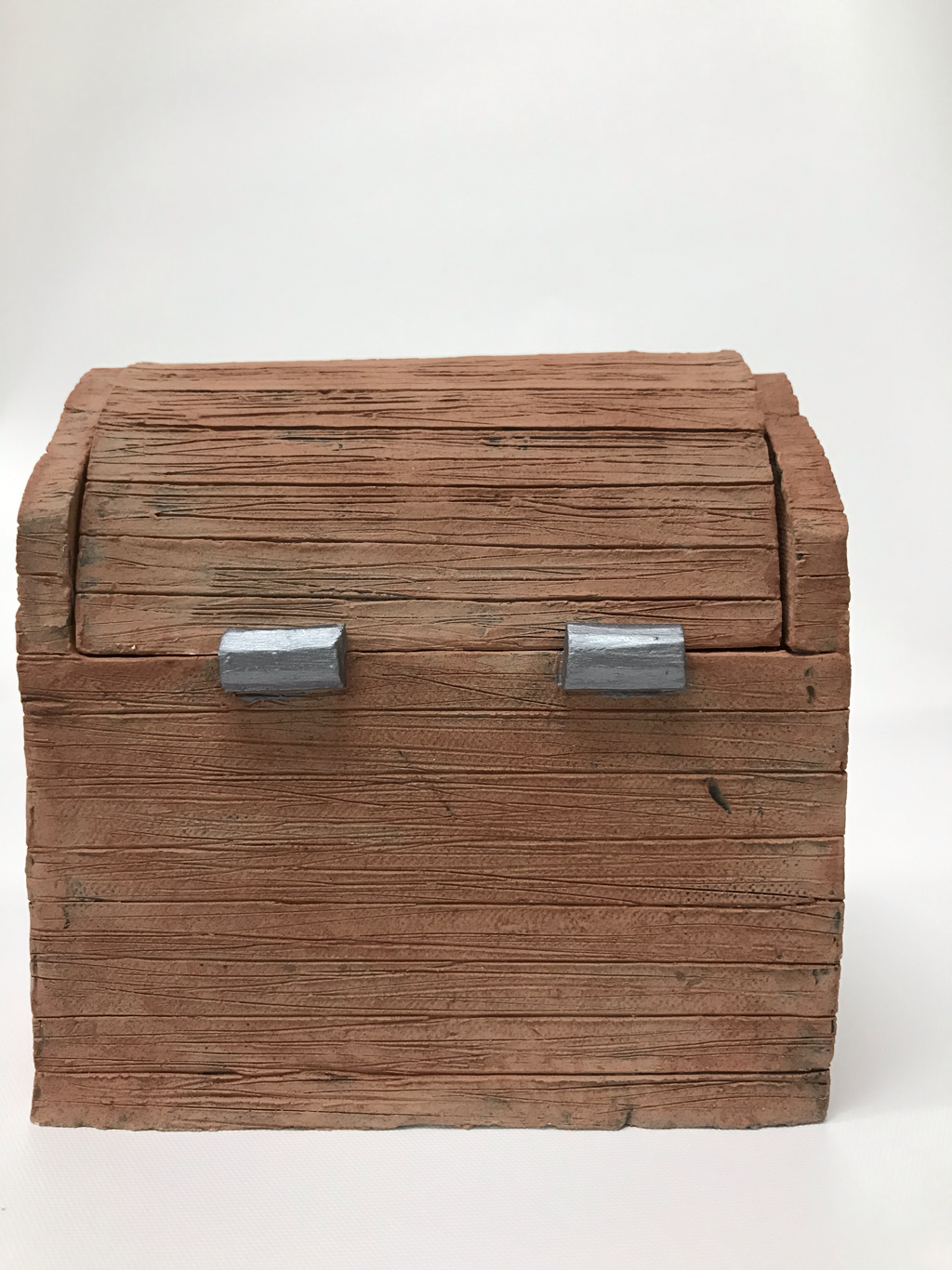
1) The art criticism process is a four part process in which one fully exams the art from multiple perspectives and concludes with their opinion on the successfulness of the art. To begin one looks at what they see is happening in the piece to describe the art. Next one evaluates the different strategies and art elements used to create the piece. After evaluating the art, one interprets the art by finding the mood, story, or feelings expressed. Lastly one judges whether or not the art is successful and leaves their opinion. 2) The piece I will be critiquing is my acrylic painting. I see a variety of clouds, a sun, ocean that connects to sand, a blend of red orange and yellow, and also a baby blue sky. The color scheme is more of vibrant colors with high light dark contrast. Some art elements are blending of colors and a little bit of depth with the size of things. I think the painting has a lot of bigger picture objects and is not so focused on the small details. The variety of colors used is pleasant to look at. I think that the balance is good because there is about equal amount of things on both sides of the painting. The mood is relaxing, due to the location of the painting, but the setting of the sun also gives a feeling time passing by. There is not any life being represented in the picture so it also shows the beauty of the world. My opinion on this piece of art is that the colors are great, but I think the sky did not turn out so well or the closer part of the water due to failing to mix the right colors. Overall I think it is still successful because the midsection looks realistic and the place is represented with the key features (sand, ocean, sun). 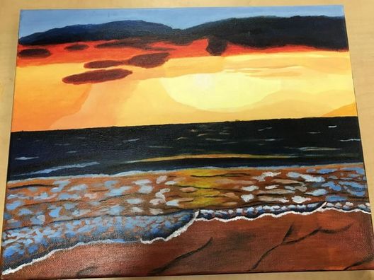 17) The sketchbook warm up that I selected was the tree painting warm up. The reason I chose this warm up is because i feel that it really turned out very well. The reason I chose this over the other warm ups is because I never really could draw or paint a realistic tree before this, In this activity we first picked a photo of a tree from the internet that we liked, and then we mixed our colors and went right into it. At the beginning I tried to make it look as realistic as possible and that simply did not work, So I just gave up on that entirely and just started to layer the different colors up until eventually, surprisingly, the tree actually looked good. 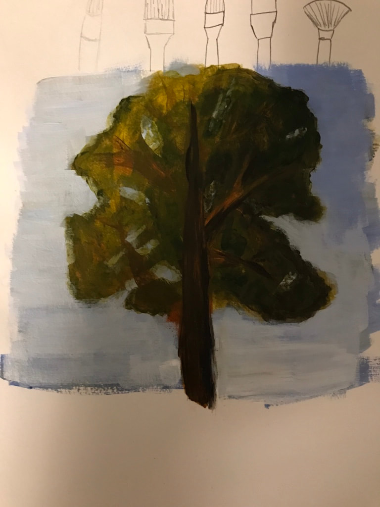 15) The project that I thought was the most successful was my clay vessel project. The theme of my vessel was a rustic chest that looks like it came from the past. To achieve this theme I made a wooden like texture on the outside of the chest and for the lock and the hinges I used silver paint to make it look like it was made out of iron or some other metal. The long process that I went through to make the piece first started with some planning about how big I wanted the piece to be. I used certain dimensions in the plan, and then I used a common scale factor to measure out the dimensions of the clay I was going to use. I ended up having to adjust the clay roller to the width that suited the size of my piece and that ended up in a couple of failures, which includes a slab of clay thoroughly mixed with paper. After I had made the clay slabs to my liking I Started to construct the vessel and I used slab joining techniques that I thought were very cool. I used slab on slab at a ninety degree angle for the bottom slab and I cut the mid section slabs' edges at a forty five degree angle to join them with minimal edge showing. I also had to bend a slab to make the top of the chest which is removable. After construction I used a variety of tools with different widths to create a wood texture. I then ended with the paint job and a good, non explosive firing. 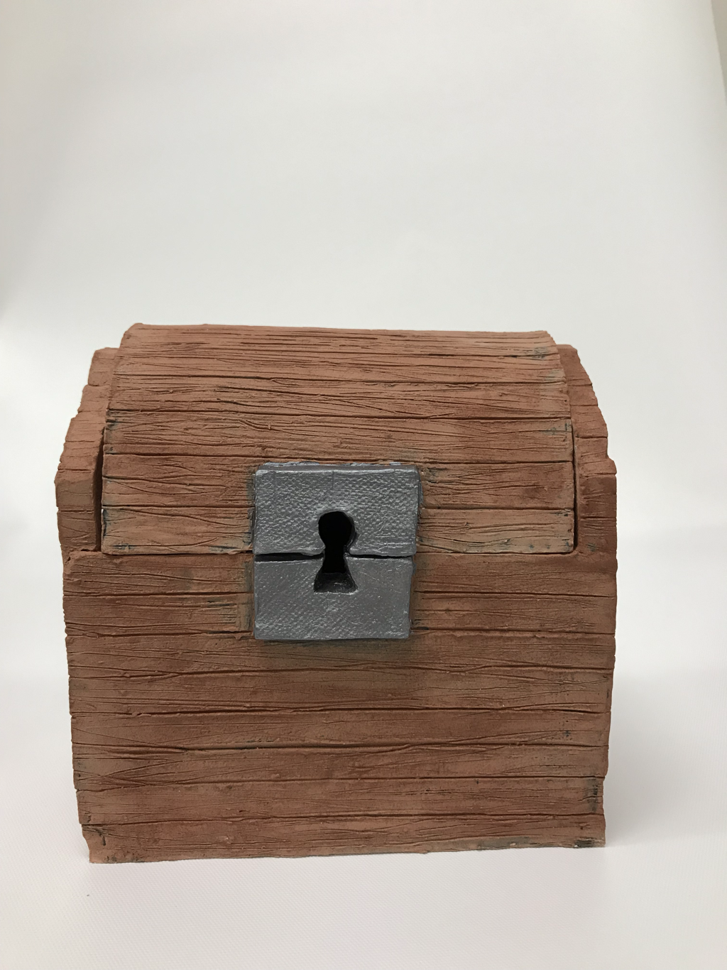 18) The medium I most enjoyed working with this year would be pencil. Although other mediums like clay and charcoal were fun also, I enjoyed learning how to use different darkness pencils to create depth, shadow, and a realistic drawing. The charcoal is messy and looks cool, but the fine lines of pencil is hard to beat in my opinion. I also think that I am biased because I like to draw at home and that is always done in pencil. The medium that I did not use but wish I had explored is probably skittles. The portraits that were made from gluing skittles ended up well and I think it would be fun to do that, especially since the smaller dovetails are not seen so there is not a big mistake when using them.The attached photos are most of my illustration friday because there was not a post for them, also my pencil project.                   
0 Comments
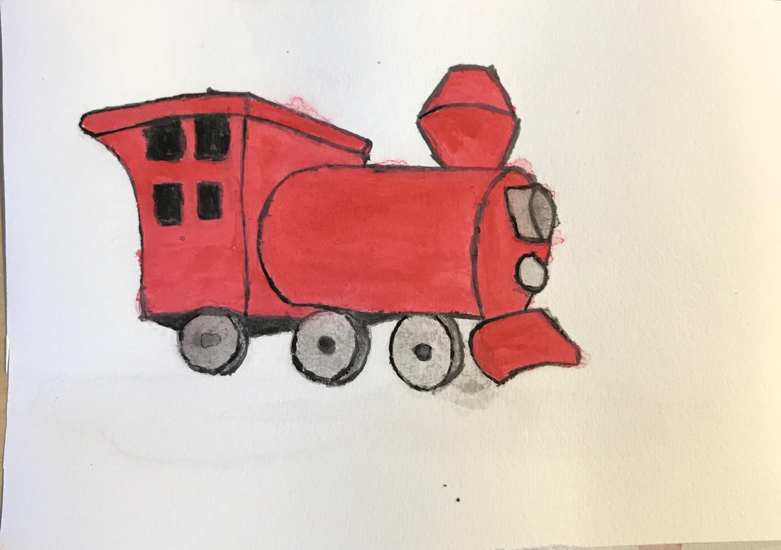
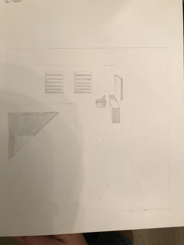
To create this project, I first got a piece of drawing paper, and cut strips off of it. I then cut the strips into the sizes I wanted and I got lots of glue. I then glued each strip on the paper and luckily they held up as it dried. Then I got another piece of drawing paper and drew the letters. Afterwards I shaded the piece. The gluing of the paper onto the drawing paper was very difficult as pretty much everything wanted to fall over all the time. Although afterwards when it dried it is pretty stable. I found it was hard to shade the letters because I couldn’t keep a continuous darkness across all the letters. I feel like the glued letters look better than the drawing, and I felt like it is a piece of art by itself. Personally I liked the drawing a lot better before I shaded it. If I were going to do this again, I think I would make the paper different colors and see how that turns out. 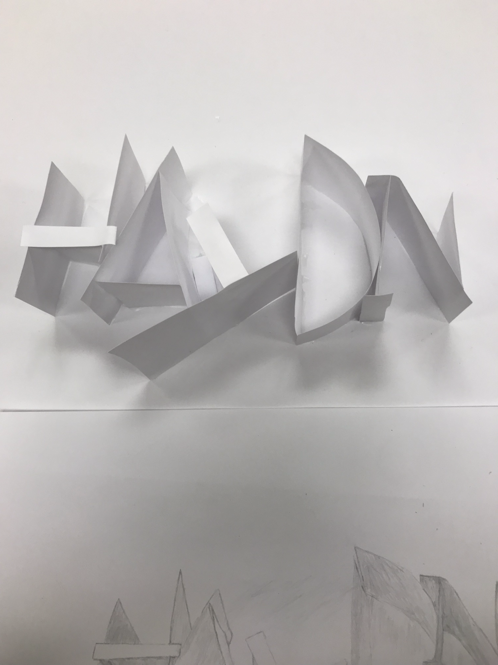 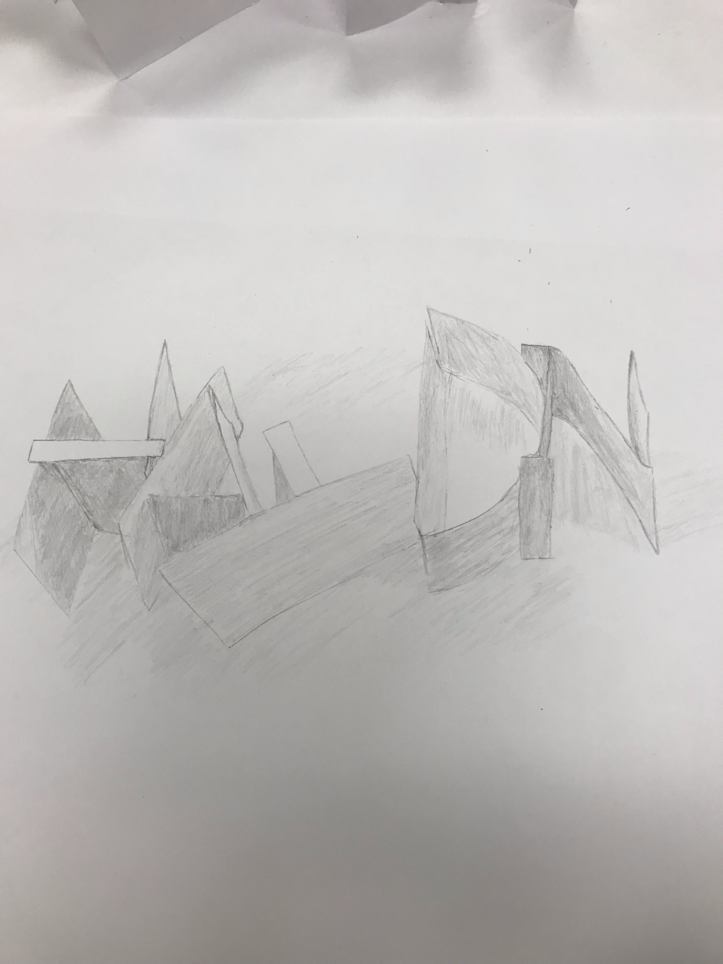 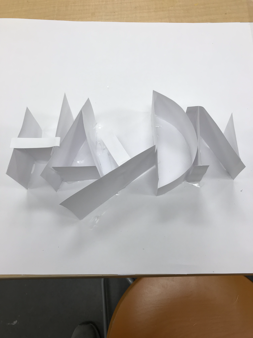 My piece is a one point perspective painting. The photo I used was taken in Vienna, Austria. This city was architecturally amazing, and our family trip was a blast. For me. painting and watercolor in general is difficult and I am much better at drawing so the fact that I had to try to paint this was difficult. In addition to that the sheer number of details in the photo was just overwhelming. The two warm ups that helped me the most were the copy a book watercolor and forced perspective photography. The copy a book helped me the most to find out how to paint with watercolor and how to use the right amount of pigment. The forced perspective photography helped me to understand perspective a little bit better. 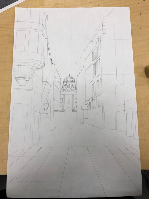 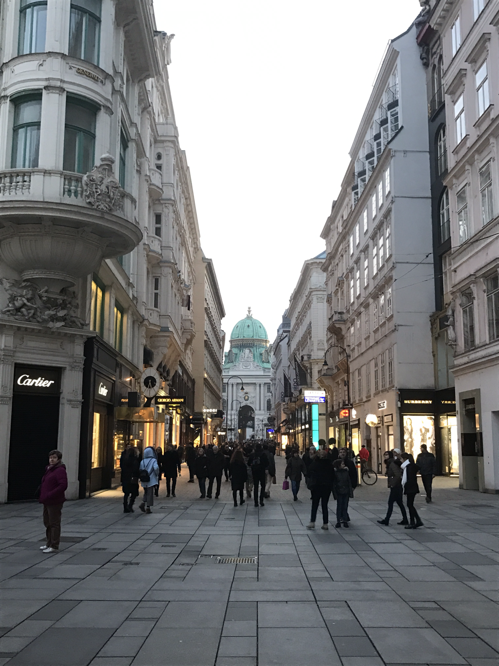 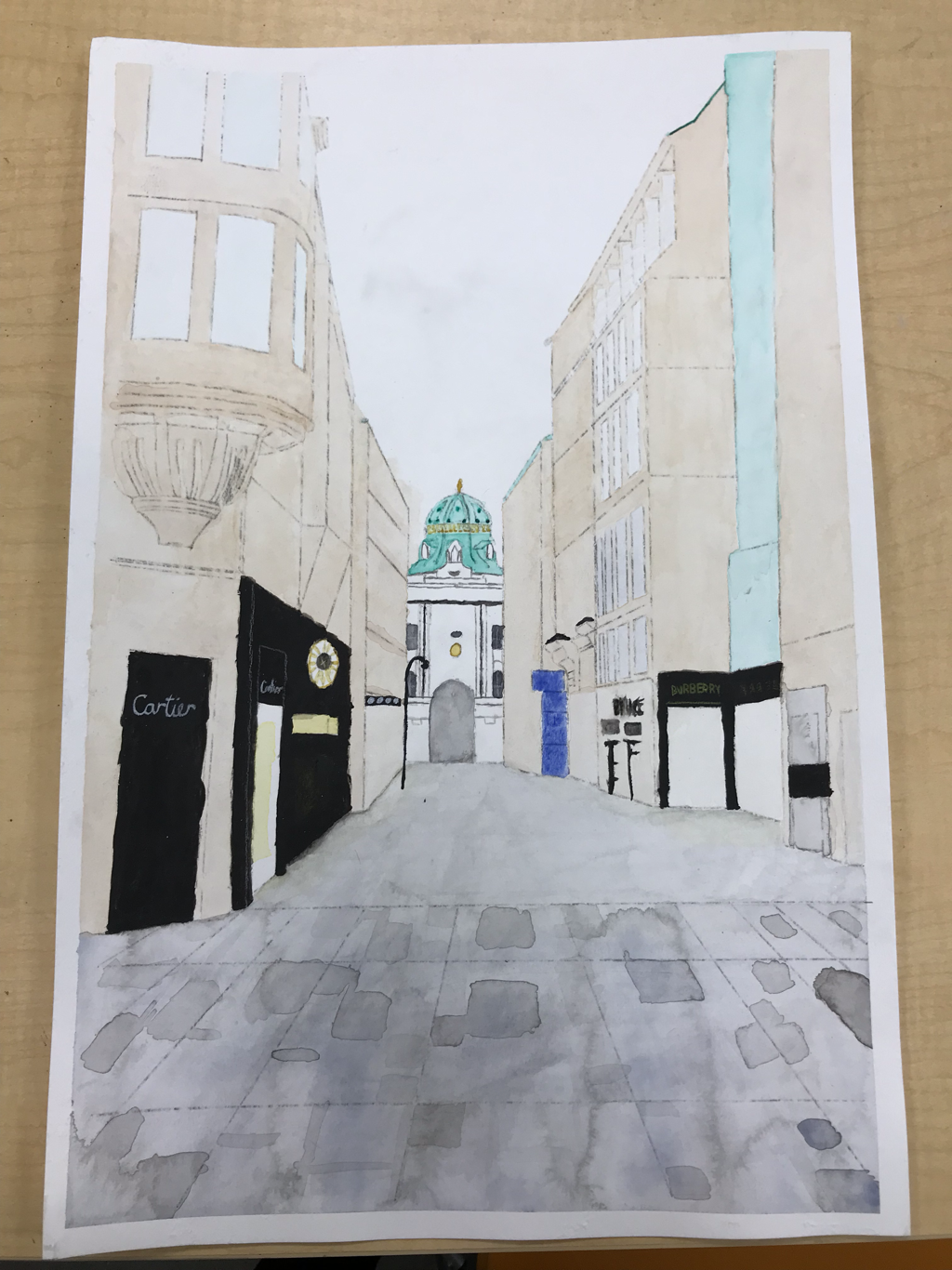   My portrait is of myself when I was much. much younger. The "relationship" does not need to be mentioned. The medium I used was pencil, paper, and lots of eraser. At the beginning I first drew out the proportions of the face starting with a sphere, and then moving on to the jaw. The first feature I did were the eyes and then I did the nose, followed by the mouth, and then the hair, and lastly the ears. I think I find the younger look successful and also the eyes were successful. If I were to do another portrait of myself I would work on my noses and also my ears because they just were not exactly what I was hoping for. Also the proportions work to draw the average shape of the head, but I needed to change them to the face I was drawing. 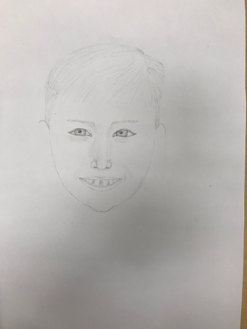 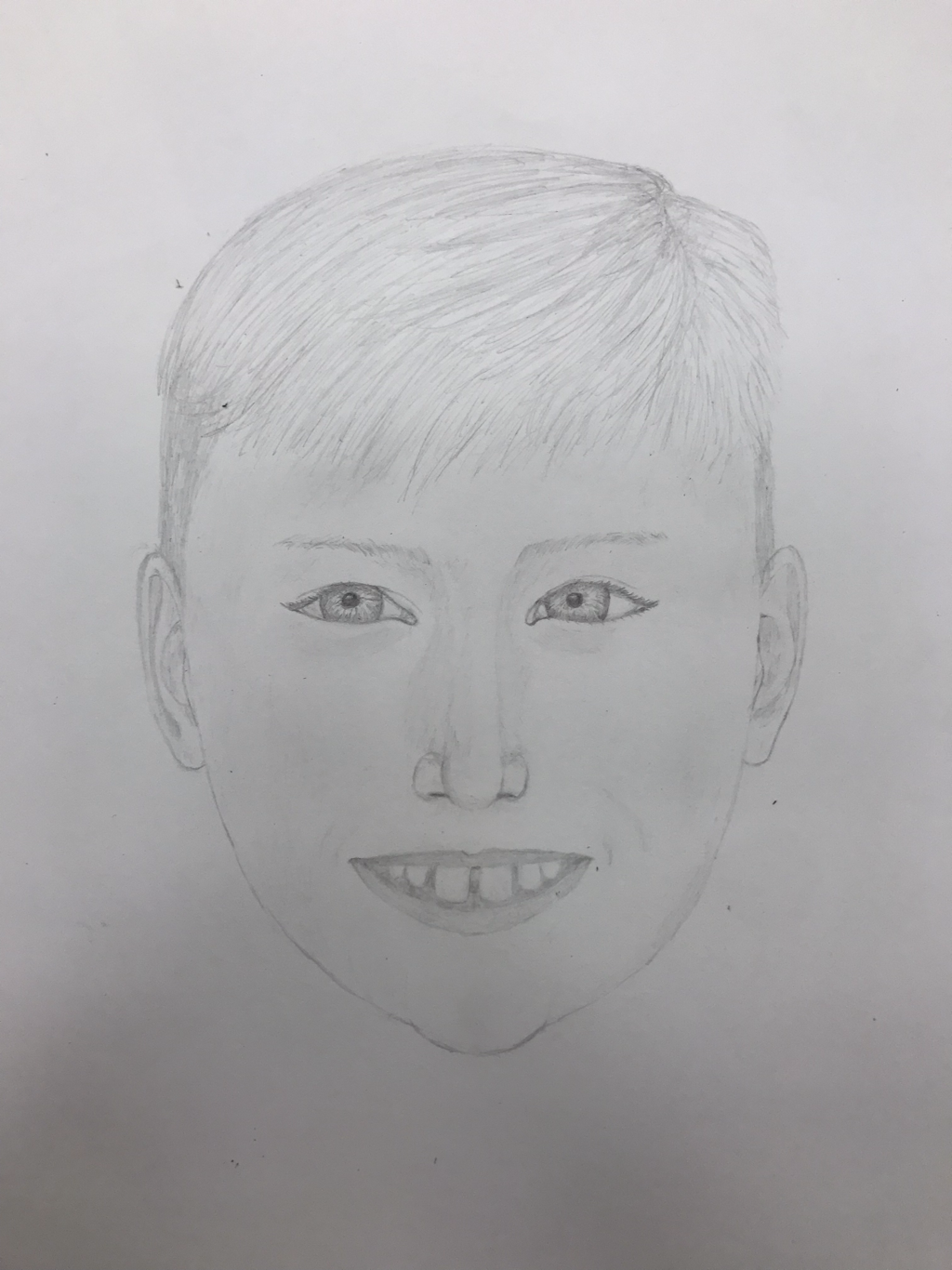 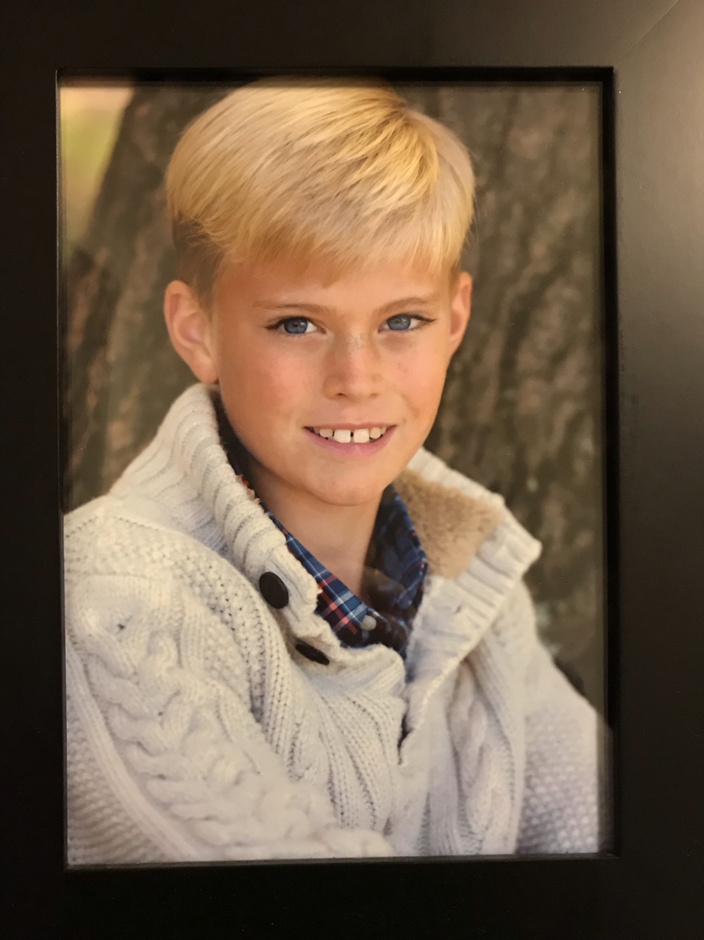 The warm up I have found most helpful so far is the proportions warm up even though it did not turn out well I got a better sense of where things are. I was able to learn a few things like how to space the eyes and also where the mouth is supposed to go. What I found most surprising is how big ears are, and also how much our hair goes out before it starts to droop. I noticed these things before but now it was more clear. 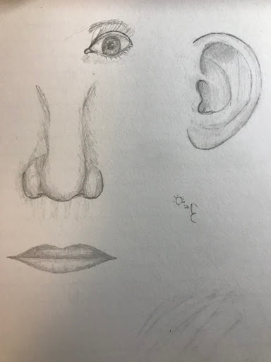    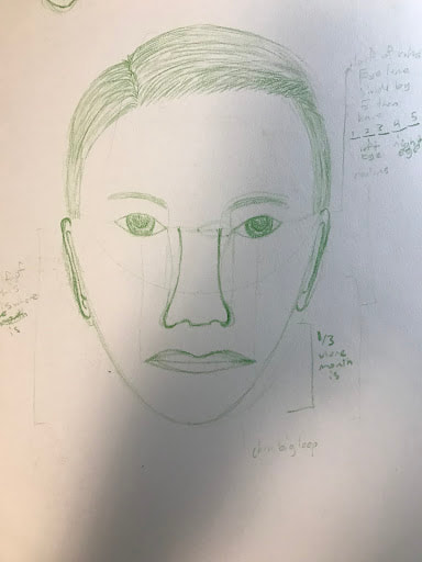 My piece shows off the theme of "line" by using a bunch of small lines to make the whole environment come to life. My piece was successful because it looks like a complete piece to me, and the different aspects of the car worked out well. If I was going to do this again I would be more careful and patient about my cutting skills because I accidentally cut a bunch of parts that I wish I had not but ended up painting over them. Also some of my lines are not clean or congruent in width. 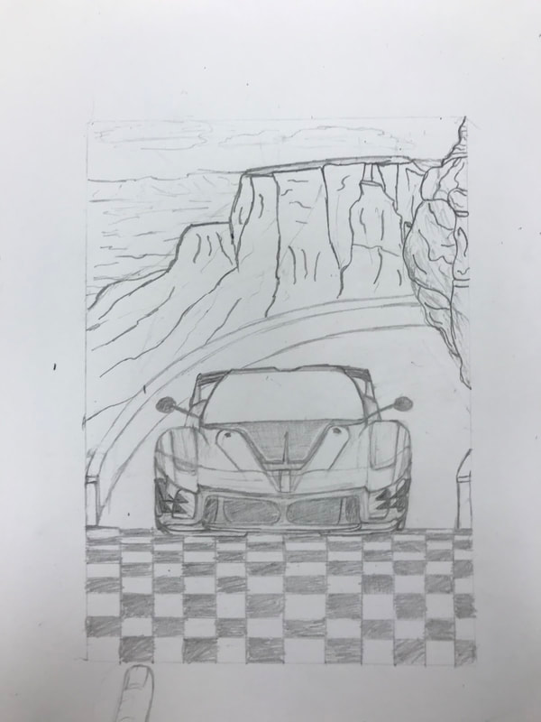 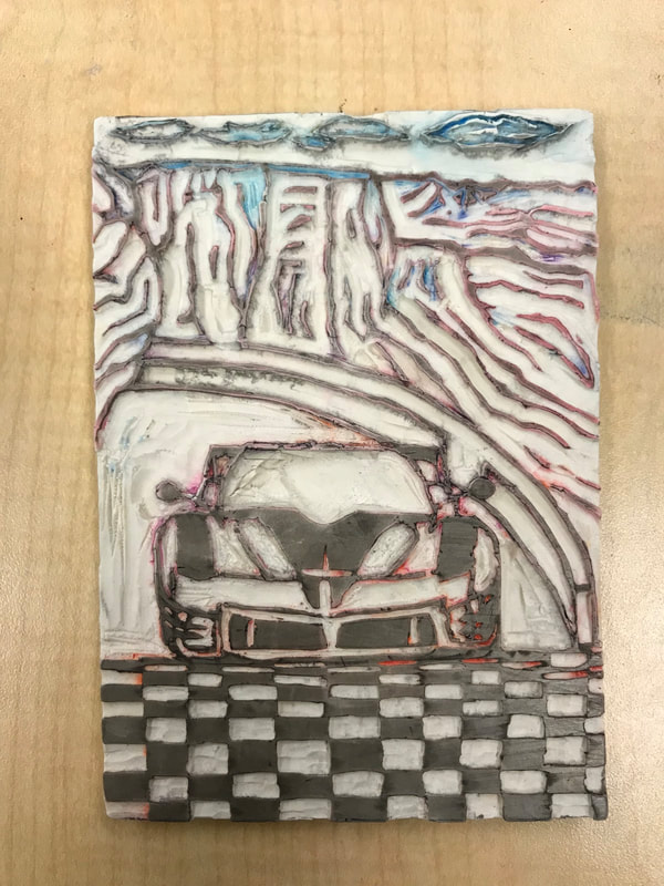 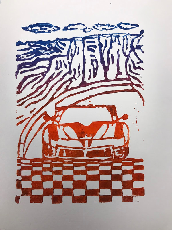 Print - The impression created on a surface by the printing plate.
Inking - the artist applies ink to the plate. This is done with a brayer. Transfer - the paper or other material is pressed against the inked plate, and the ink is transferred to the new surface. Edition - all prints made from the same plate or set of plates form an edition. Relief printing - in this method, the artist cuts away the section of a surface not meant to hold ink. As a result the image is raised from the background. Wood blocking is a Japanese technique which the artist carves into a wood block and uses it as a plate to make many prints. Ando hiroshige, a renowned artist at his time apprenticed as under Hokusai hiroshige as a painter and later became more successful than his role mode. He was the last great artist to work on Ukiyo printmaking and made more than 5,400 prints.
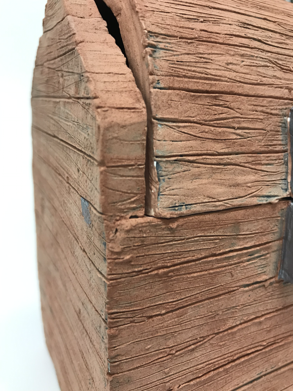 Since my in progress post, I have painted the sculpture in black under-glaze, which was then covered in a light brown under-glaze, and then another layer of darker brown under-glaze. After the sculpture was fired I painted a shiny silver acrylic paint on the metal lock and "hinges".
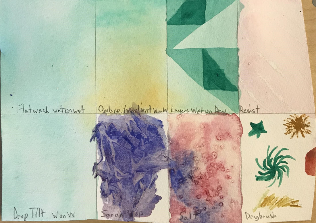
I think that the dark color and wood texture turned out pretty good. I like how the black under-glaze gives it a rustic look. If I were to do this again, which would definitely not happen :) , I would be sure to handle the clay less and I would make sure all my dimensions are correct. The activity that I found was most helpful was the illustration from a children's book warm up. This is because it helped me to understand how You need to be careful about watercolor because once you do something you cannot take it back, I also learned that the colors will fade as they dry, as well as the point that I needed to use more watercolor pigment when painting.
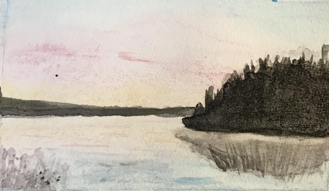
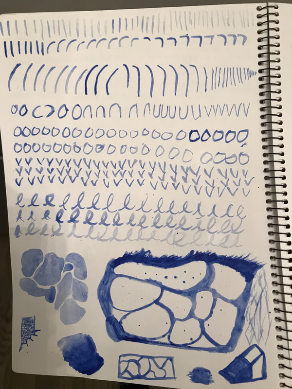
I like that watercolor blends very easily and that I do not have to mix a bunch of colors together all the time. I find that making the lines that I want to with watercolor is really difficult because the water seeps out some times into areas that were supposed to be a different color. I also find it difficult to make the right brush strokes for different textures. |